5 comments
  •   posted in: 
  • WPF

Every WPF developer should come across these three tools at some point in their career. These tools are extremely valuable for debugging, developing, cleaning and optimizing WPF applications. I can't believe how many months I went without using these tools to their full abilities, but now I use them on a daily basis. Below is a brief description of each tool along with links to where you can download them.

Pistachio

pistachio

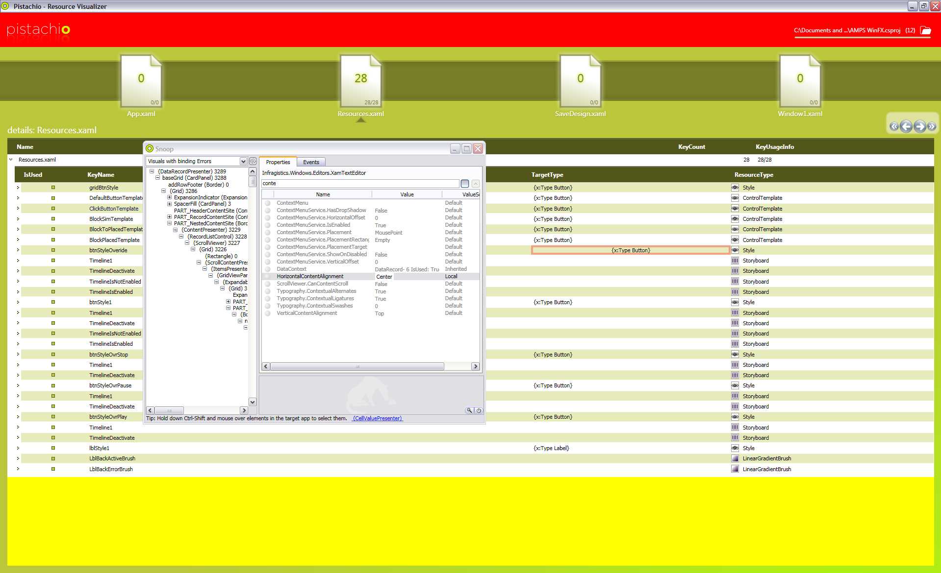
A WPF resource visualizer that allows you to open a project file (.csproj) and view all of the resources that you are using. It points out what files are using a particular resource and what line number it is on ... however it doesn't 'open' that file when the user clicks on the name of the file, even though a hyperlink-looking file name tells the user differently ... maybe this is something that will come out in a future update??? But nonetheless this is a great utility that one can step back from the inner workings of the project and see where all of your resources that you are using really live. I know I have cleaned up many resource files and in doing so improved the overall performance of my WPF apps. It also has some slick animations with their carousel and the design / colors of it are superb! Here's the site where you can download Pistachio:

http://www.granthinkson.com/2007/11/08/announcing-pistachio-wpf-resource-visualizer

and here's a direct link to the download:

http://www.granthinkson.com/wp-content/uploads/2007/11/pistachio.zip


Snoop

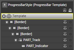
By far my favorite tool when debugging WPF apps, especially at a visual level, Snoop provides such a quick and efficient way to visually inspect my applications. Just run the .exe and tell snoop which WPF application to insepct. A window will pop up that stays on top of your application at all times (you can minimize it) and displays the visual tree on the left side (with the name of your elements, their type and how many children they contain) along with all of the properties and events on the right side. The properties tab shows all of the properties names, values and values' source of the selected visual item from the visual tree. Here you can inspect what values are on certain properties of particular elements and then change that value and watch as it changes in your application instantaneously!!! This is such a cool feature, and the change is persisted throughout the entire lifespan that your application is running as long as snoop is running. This is a great feature for changing colors, visibilities, sizes and many many other properties. You can also search for properties and even hold down ctrl-shift and mouse-over your application to instantly view what the visual element is. One note about the ctrl-shift is that snoop digs down into templates and usually down a layer or two more than what you are expecting, but that's a good thing, right? Of course it is, you can see what template that the visual element is receiving and if any of those values are being trumped by any local values.

Snoop also provides a nifty way to inspect visual data binding errors. In the upper left corner there is a drop down box that you can open and select 'Visuals with binding Errors' to see a list of visual data binding errors that your application has. This is a great tool to try to figure out why some binding expression may not be working. You can then select the property on the right side of the application and right-click to delve into the binding or binding expression for finer detail of the error. Also, when a property value changes the whole property's background changes to yellow for a second to grab the users attention.

snoop

One last nifty feature is that snoop allows you to view a list of events that you specify that occur in your application. You can see what elements are affected when you click on them and see who handles that click (if anyone) as well. Handled events are displayed in green. This is a great way to see the difference between tunneling and bubbling events and how they can affect your visual elements if they are handled too soon or not at all.

Here is the direct link and prettier pictures / more in depth on snoop's features:

http://blois.us/Snoop/

However, snoop comes with full source and you must compile it first to use it. For the weary of heart you can download the compiled version with a little extra (an actual snoop icon!) at the bottom of the page. For some reason snoop never had an icon so I made one and used it in the project. The icon is also available for you to download.


Mole

Mole is the only evolving visualizer that I know of at this time. It looks very promising so far and will only get better. Mole has taken what snoop has to offer and gone beyond my expectations, with each new release surprising me even more. My only complaint about mole (and I understand that mole is a debugger visualizer) is that I can't use it how I can use snoop; a free standing application. You start mole from inside visual studio while at a breakpoint by clicking on the magnifying glass and selecting mole from your list of visual debuggers. That said, mole is worth the download and then some.

mole

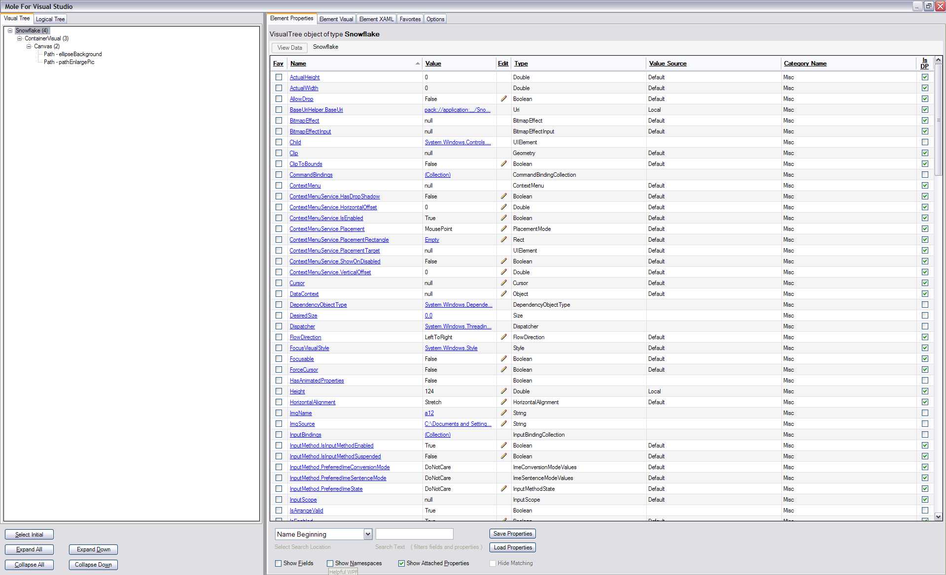
Mole offers the visual tree and the logical tree on the left much like snoop with a list of properties on the right. Mole offers a little more detail about the properties with more options to view certain groups that may interest you. You can also edit a property's value and have it be preserved throughout the applications life! You can look at a visual of that element, XAML code for that element (even if that visual was written in code), mark favorites and compare properties to each other from different runs of the program by saving the list of properties to an xml file.

Here is the codeproject site where you can download mole from; it continues to evolve so be sure to check back there for the latest!


If you have any other great WPF tools or just want to share your thoughts please do!

filefile size
Snoop.zip61.73 KB
Snoop.ico3.55 KB

0 comments
  •   posted in: 
  • WPF

If your just interested on the post topic feel free to skip this paragraph; just me talking about the past 3 months and what has been going on in my life. 3 months since my last post .... wow, life sure has been crazy. Not only with the holidays being crazy as usual, I also got married and went on my honeymoon!!! All of my tasks for the wedding just seemed to hit all at once and things got crazy from then on, until the wedding day of course. Everything went very well on my wedding day, the limo was a 67' Rolls Royce and the food at the reception was absolutely amazing, well what little I had! Then it was off the Maui, Hawaii where my wife and I stayed for a week and a half. It was gorgeous, too pretty for pictures to describe (and yes, there are many many pictures, over 12 GB worth!!!). My wife is a photographer and so she was prepared ;)  I took some pictures too, and one of them is on our wall in our living room, go me! But alas the good times were interrupted by the worst storm since 1980 ... rain rain rain. It made the water all muddy with debris everywhere, flash floods, and 100+ mph wind gusts! Luckily Maui is extremely small (70 miles wide) and we were able to drive through the storm to the other side of the island and find some sunshine, some days. Even though 7 out of the 9 days were filled with rain, we found time to enjoy Maui to its fullest. I would especially recommend Mama's Fish house, a little pricey (like all other restaurants on the island) but they had the best food of all; try the parmesan crusted, crab and lobster filled Mahi Mahi, the best fish I have ever had! Then the honeymoon was over and the holidays upon us. Of course we had to catch back up with work and then off for the holidays and then back to work so my time has been busy. Oh, and you think taking time off from work would provide me with some time to blog / code, not really ... the Mrs. had other plans, more housework! But now things have settled down some and I am starting to get back into the groove of things at home and at work. So stay tuned for more posts, I have about 3 more ideas I want to blog about already! And now onto the snowflakes!

snowflakepic1

Above is a picture of the snowflake picture project. I have provided full source as well as just the executable for all interested. Let me first say that the code was written purely for my rehearsal dinner slide show and thus it is not formatted or commented as well as it should be. But it does work and provide another alternative way to think about a slide show presentation that can be created quickly.

The program looks for all .jpg files in your MyPictures directory and all of its subdirectories. It then makes a vector snowflake outline and paints the image onto its background. There is simple, very simply math that moves the snowflakes from the top to the bottom of the screen and sways them back and forth. I did not have much time to write a better algorithm for animating the falling and swaying of the snowflakes, feel free to write a better one and share it! Here's the gist of the algorithm:

- get the total height of the screen and apply a translate transform to each snowflake on its y-axis. Each transform has a random number assigned to it for the time interval to fall, this number is constrained by minimum and maximum bounds. Once the snowflake passes the bottom of the screen, clear its transform and apply another. Repeat indefinitely.

- each snowflake also has an x-axis translate transform applied to it that uses two random numbers to move it some delta over some random time.

Now this algorithm is by far simple and it shows when you run the application from time to time. If the random numbers are all very close (maybe I am using the random class wrong) then the snowflakes bunch up. Also, all of the snowflakes start at a similar position and are not offset by much.

The program also enlarges and centers (on the y-axis) 1 snowflake at a time throughout the life of the program. This is to give that full screen picture effect so you can view the whole picture better. When the snowflake is enlarging the vector graphic that holds the image changes to open the center up some and all you to view most of the image. There is another xaml graphic in the solution that allows for a closed center for the enlarged snowflake; these are found in 'Snowflake.xaml'.

Feel free to change the code, use your own falling algorithm, your own graphics and make any changes you would like. If you do make some cool changes please share them! I had another version that I did not include due to space issues, that had music throughout the programs life and overlay text in the beginning for some description about the presentation.

To close the program, mouse over the upper right for 'close' to appear and click on it. Enjoy!

filefile size
SnowflakesSource.zip558.38 KB
Snowflakes.zip554.61 KB

9 comments
  •   posted in: 
  • WPF

Notice that when you use an expander and expand / collapse it that there is a jerkiness depending on the number of elements that you have in it. So to solve this problem you can animate the expand / collapse events that get fired to smoothly open and close. Easy, right?

Well yes and no. You can animate the expanded event pretty easily using the routedEvent "Expander.Expanded" and then apply some transformation that either calculates the height, has a predefined height or (what I like to do) use a layoutTransform and animate the y scale from 0 to 1. Ok ok, that's not terribly hard to accomplish; here's how:

<StackPanel>

  <StackPanel.Triggers>

    <EventTrigger RoutedEvent="Expander.Expanded" SourceName="expander">

      <EventTrigger.Actions>

        <BeginStoryboard>

          <Storyboard>

            <DoubleAnimation From="0" To="1" Duration="0:0:0.25" Storyboard.TargetName="listBox" Storyboard.TargetProperty="(FrameworkElement.LayoutTransform).(ScaleTransform.ScaleY)"/>

          </Storyboard>

        </BeginStoryboard>

      </EventTrigger.Actions>

    </EventTrigger>

  </StackPanel.Triggers>

  <Expander x:Name="expander" Header="Expander">

    <ListBox x:Name="listBox">

      <ListBoxItem Content="ListBoxItem" />

      <ListBoxItem Content="ListBoxItem" />

      <ListBoxItem Content="ListBoxItem" />

      <ListBox.LayoutTransform>

        <ScaleTransform ScaleX="1" ScaleY="0"/>

      </ListBox.LayoutTransform>

    </ListBox>

  </Expander>

</StackPanel>

Now that works pretty nice, but wait, try to collapse it ... ugly! So we need to do the same thing to the routedEvent "Expander.Collapsed". Hrmm ... on second thought that won't work because the collapsed event sets the expandSites (the expanders content that expands / collapses) visibility to collapsed right away!

So we need to fix this. Here's one approach that overrides the template of the expander and removes the setter that sets the visibility to collapsed. Instead, we are going to animate the layoutTransform on the y scale to 0 for a smooth collapse. We will also do this on the expand event as well, and since we are using the expanders template we will actually be using the IsExpanded property on the expander. This allows us to have a trigger that has enterActions and exitActions so we can easily start off the appropriate animation.

I used Blend to override the template (and thus messy code is produced :) ) and then edited the IsExpanded property appropriately. Attached is the full source code in all xaml that gets the job done. Note 'Timeline1' and 'Timeline2' as they are the storyboards for animating the expanded and collapsed events, respectively. If you have any questions or ways to improve this please let me know!

filefile size
ExpanderAnimateCollapsed.xaml19.42 KB

0 comments
  •   posted in: 
  • WPF

Ever use the opacity property to give some element a see-through effect? It's pretty cool the results you can get, but you can also run into some problems. For instance, you have some container of elements and you want to give that containers background a see-through effect. So apply an opacity of 0.50 to the container and your done! Well, not so fast. Once you do this all of the containers children will also get this effect and thus everything looks to be faded out, as shown below:

OpacityEffect_half

Well that's not what we wanted, we just wanted the background to be faded. Well there's a couple of things you could do to solve this problem. One, you could use blend to make a semi-transparent background and just use that brush as the background, but this could be time consuming and is not a general rule of practice to accomplish this effect. Another way, the way I prefer (unless you can convince me otherwise) is to overlay 2 elements on top of each other and give the bottom one the faded look. This way, the top element (and all of its children) will retain their full transparency and not be faded; of course you can fade these elements as well and get a multi-level look and feel of the faded elements.

So how do you overlay one element on another and give the bottom one the faded look? Well this is one way that I have found to be fast and efficient. Place the 2 main parent elements in a grid so that they overlap one another.

<Grid/>

Make sure you place the element that you want to be faded on the bottom by adding that element to the grid first; in XAML just place this element in the grid first. Then give that first element an opacity of something between 0 and 1. 0 means that the element is completely see through and therefore not visually seen (but still hit testable!) and 1 means the element is in full color! Also, be sure to give that first element some sort of fill / background that fills up the entire area that you want to give the faded look to. Your good to go now!

But if you want some extra help and an example keep reading. What I prefer to use as my bottom element is a Rectangle. This is a light-weight shape (shapes are not all that great sometimes, more to come soon on that topic) that gets the job done. You could have just as easy used a Border or some other light-weight element. The trick with using one of these elements that do not automatically fill up its parent (the grid) is to set its width and height to its parent width and height. Now you could hardcode these values in, but that is a big no-no if you ever want to make you application modular. Plus, its much easier to to have things grow / shrink according to the users preference and how they like to use / view the application.

So the trick is to bind the rectangles (or whatever else you are using as the bottom element in the grid) width and height to the parents width and height (which is the grids width and height). You can accomplish this with the following example:

<Rectangle Width="{Binding RelativeSource={RelativeSource Self}, Path=Parent.ActualWidth}"

           Height="{Binding RelativeSource={RelativeSource Self}, Path=Parent.ActualHeight}"

           Fill="Gray" Opacity="0.65" />

Shown below are the 2 code snippets that have been combined to produce the overall effect we were going for:

OpacityEffect_full

<Grid Width="200" Height="200">

  <Rectangle Width="{Binding RelativeSource={RelativeSource Self}, Path=Parent.ActualWidth}"

            Height="{Binding RelativeSource={RelativeSource Self}, Path=Parent.ActualHeight}"

            Fill="Black" Opacity="0.5" />

  <StackPanel Background="Blue" Width="150" Height="70">

    <Button Width="100" Content="1st Element" Margin="0,5,0,5" />

    <Button Width="100" Content="2nd Element" Margin="0,5,0,5" />

  </StackPanel>

</Grid>

As you can see, the Rectangle's width and height are binding to the parents ActualWidth and ActualHeight, respectively. This way, after layout occurs on the grid the rectangle will fill its width and height to the grids'. Now sometimes that won't work depending on how things are laid out. I will go into this in more detail in a later post, but for now try using plain old Parent.Width and Parent.Height and see if that works, such as below:

<Rectangle Width="{Binding RelativeSource={RelativeSource Self}, Path=Parent.Width}"

           Height="{Binding RelativeSource={RelativeSource Self}, Path=Parent.Height}"

           Fill="Black" Opacity="0.65" />

If that does not work, feel free to drop me a line and I will see if I can help you out. If you come up with any cool ways to use the opacity property or have any other comments please leave them.

4 comments
  •   posted in: 
  • WPF

Some of our hardware that we are currently using at work required time to fully charge up before it could be used again. After 'x' amount of seconds the signal would be fully charged and ready for action. Now the typical way that this could be presented to the user would be an on / off state where off is when the signal is not present or when it is charging and on when the signal is ready to be used. But, what about a progress bar! Just slap in a progress bar and bind its value to the signal and wa-laa, done. But of course does that green bar being filled up really fit in with the application being developed?

Most of the time it can, but it could fit in a bit better. So I took a little bit of time to dig into the ProgressBar element that WPF provides. By default, the progress bar can be used with the following line of code and you get the result to the right:

<ProgressBarValue="75"Height="25"Width="150"/>

ProgressBar

Pretty standard, huh? Well, I wanted to jazz it up a bit and allow the progress of our signal being charged to fit into our application a bit better. So, the first step in doing so is to take a look at the ProgressBar's default visual tree (copy of its control template). Below is what Blend tells us about it:

ProgressBarTemplateBlend

Looks like we are dealing with 3 Borders and 2 other elements names PART_Track and PART_Indicator. Well the real magic lies in those 2 oddly named elements! These names allow for us to gain some great logic that Microsoft already implemented. For this example, when you have these 2 elements with those names the PART_Indicator will ensure that the width (or height if orientation = vertical ) remains the correct percentage of the width(or height) of the PART_Track taking care of the math to fill in the progress bar, based on the progress bar's Value, Minimum and Maximum properties. This is a huge benefit for us to take advantage of, especially since we can manipulate the look to be whatever we can dream of and have the control itself do all the math!

Digging into the PART_Track element, we see that it is of type DockPanel and it contains only 1 child, PART_Indicator which is of type Rectangle. The PART_Track element is a container for the area to be filled up by the PART_Indicator. The PART_Indicator are the little green rectangles that are filling up the progress bar.

Let us first manipulate PART_Track into looking a little different then the standard rectangle shape. First, change the type of PART_Track to something other than a DockPanel; I have changed it to a Path. I chose a Path since I can add an attached property called Data that will allow me to change the way PART_Track looks. I used Design to draw a new design with the pen and then export it as a Path:

<Path x:Name="PART_Track" HorizontalAlignment="Left" Stretch="Fill" StrokeLineJoin="Round" Stroke="Black" StrokeThickness="2" Data="F1 M 72.5,114.333L 123.833,114.333L 123.833,99.8889L 126.278,114.667L 131.944,102.778L 128.833,114.667L 135.611,108L 131.611,115.222L 135.611,120.222L 131.167,117.333L 130.833,125.778L 128.5,117.556L 124.167,129.556L 123.722,117.667L 72.5,117.667L 72.5,114.333 Z ">

As you can see, the largest attached property is Data which contains the actual points to correctly draw the path. Below is what the path should look like:

PathData

I know, I'm no graphic artist but at least it's something different than a rectangle! So this is, hopefully, our outline for our progress bar. Now Path does not contain an Content property or something to hold a child since it is not a container. So lets just put our PART_Indicator below this element for now. Remember to put both of these elements in some sort of container and I would suggest a grid since we want the PART_Indicator to fill the PART_Track and they can lie on top of each other. So far we have the following code:

<ControlTemplate x:Key="progressBarBang" TargetType="{x:Type ProgressBar}">

  <Grid>

    <Path x:Name="PART_Track" HorizontalAlignment="Left" Stretch="Fill" StrokeLineJoin="Round" Stroke="Black" StrokeThickness="2" Data="F1 M 72.5,114.333L 123.833,114.333L 123.833,99.8889L 126.278,114.667L 131.944,102.778L 128.833,114.667L 135.611,108L 131.611,115.222L 135.611,120.222L 131.167,117.333L 130.833,125.778L 128.5,117.556L 124.167,129.556L 123.722,117.667L 72.5,117.667L 72.5,114.333 Z "/>

    <Rectangle HorizontalAlignment="Left" Margin="1" x:Name="PART_Indicator" />

  </Grid>

</ControlTemplate>

And when we run this we get ... uh oh, same thing as above! What went wrong ... well, just having the magic name PART_Indicator in some element within the control template is not quite enough to display it correctly. For our scenario here, we would like the PART_Track to be filled by the PART_Indicator. I won't go through some of the magic that is below, but basically the fill property on the path is using a converter that Microsoft already provides in the PresentationFramework.Luna.dll named ProgressBarBrushConverter. Microsoft uses the converter to actually create each green rectangle that the PART_Indicator needs to show. The converter is used as the fill property is binding to 5 property's; 2 from its parent (the progress bar), 2 from the PART_Indicator and the other from PART_Track. (I will provide the actual code that I got using reflector in my sample).

<ControlTemplate x:Key="progressBarBangFill" TargetType="{x:Type ProgressBar}">

  <Grid>

    <Path x:Name="PART_Track" HorizontalAlignment="Left" Stretch="Fill" StrokeLineJoin="Round" Stroke="Black" StrokeThickness="2" Data="F1 M 72.5,114.333L 123.833,114.333L 123.833,99.8889L 126.278,114.667L 131.944,102.778L 128.833,114.667L 135.611,108L 131.611,115.222L 135.611,120.222L 131.167,117.333L 130.833,125.778L 128.5,117.556L 124.167,129.556L 123.722,117.667L 72.5,117.667L 72.5,114.333 Z ">

      <Path.Fill>

        <MultiBinding>

          <MultiBinding.Converter>

            <converters:ProgressBarBrushConverter />

          </MultiBinding.Converter>

          <Binding Path="Foreground" RelativeSource="{RelativeSource TemplatedParent}"/>

          <Binding Path="IsIndeterminate" RelativeSource="{RelativeSource TemplatedParent}"/>

          <Binding Path="ActualWidth" ElementName="PART_Indicator"/>

          <Binding Path="ActualHeight" ElementName="PART_Indicator"/>

          <Binding Path="ActualWidth" ElementName="PART_Track"/>

        </MultiBinding>

      </Path.Fill>

    </Path>

    <Decorator HorizontalAlignment="Left" Margin="1" x:Name="PART_Indicator" />

  </Grid>

</ControlTemplate>

and it looks a little something like this:

ProgressBarCompletedTemplate

As you can see, when the progress bar gets filled up it automatically stretches and fills up the occupying space that the path gives it. Thanks Microsoft for doing that math for me!

Here's the complete code to the above example with a slider that allows you to control the progress of the progress bar:

<Page

  xmlns=http://schemas.microsoft.com/winfx/2006/xaml/presentation

  xmlns:x=http://schemas.microsoft.com/winfx/2006/xaml

  xmlns:Microsoft_Windows_Themes_Luna="clr-namespace:Microsoft.Windows.Themes;assembly=PresentationFramework.Luna"

  >

  <Page.Resources>

    <ControlTemplate x:Key="progressBarBang" TargetType="{x:Type ProgressBar}">

      <Grid>

        <Path x:Name="PART_Track" HorizontalAlignment="Left" Stretch="Fill" StrokeLineJoin="Round" Stroke="Black" StrokeThickness="2" Data="F1 M 72.5,114.333L 123.833,114.333L 123.833,99.8889L 126.278,114.667L 131.944,102.778L 128.833,114.667L 135.611,108L 131.611,115.222L 135.611,120.222L 131.167,117.333L 130.833,125.778L 128.5,117.556L 124.167,129.556L 123.722,117.667L 72.5,117.667L 72.5,114.333 Z ">

          <Path.Fill>

            <MultiBinding>

              <MultiBinding.Converter>

                <Microsoft_Windows_Themes_Luna:ProgressBarBrushConverter />

              </MultiBinding.Converter>

              <Binding Path="Foreground" RelativeSource="{RelativeSource TemplatedParent}"/>

              <Binding Path="IsIndeterminate" RelativeSource="{RelativeSource TemplatedParent}"/>

              <Binding Path="ActualWidth" ElementName="PART_Indicator"/>

              <Binding Path="ActualHeight" ElementName="PART_Indicator"/>

              <Binding Path="ActualWidth" ElementName="PART_Track"/>

            </MultiBinding>

          </Path.Fill>

        </Path>

        <Rectangle x:Name="PART_Indicator" HorizontalAlignment="Left" Margin="1" />

      </Grid>

    </ControlTemplate>

  </Page.Resources>


  <StackPanel>

    <ProgressBar Template="{StaticResource progressBarBang}" Value="{Binding ElementName=sliderCharge, Path=Value, Mode=OneWay}" Height="75" Width="150" />

    <Slider x:Name="sliderCharge" Minimum="0" Maximum="100" LargeChange="25" TickFrequency="10" TickPlacement="BottomRight" Value="50" Width="200" Margin="0,15,0,0" HorizontalAlignment="Center"/>

  </StackPanel>

</Page>

Just copy and paste into something like XAMLPad or Kaxaml to see it in action!

Now if you wanted to change the Path data to something a bit more interesting you could do that. I used Design again and exported some text as 1 whole path and changed the foreground to red and added 1 trigger for when the value reaches the maximum to change the outline to a different color and change the actual path data. I got the following:

ProgressBarCharging     ---->     ProgressBarCharged

I have posted the full source code to this and some more examples that I threw together. The .xaml file contains all of the examples that the VS example has except for the vista style progress bar. This is due to the xmlns definition not being found for some reason that contains the correct converter for the vista progress bar. You have to actually include that dll as a reference in your project for it to work. If someone can get it to work through straight xaml I would gladly like to see. The straight .xaml file can be run in internet explorer. Enjoy, and please leave any and all feedback.

filefile size
ProgressBarExamples.zip87.57 KB
ProgressBarExamples.xaml14.4 KB