Some of our hardware that we are currently using at work required time to fully charge up before it could be used again. After 'x' amount of seconds the signal would be fully charged and ready for action. Now the typical way that this could be presented to the user would be an on / off state where off is when the signal is not present or when it is charging and on when the signal is ready to be used. But, what about a progress bar! Just slap in a progress bar and bind its value to the signal and wa-laa, done. But of course does that green bar being filled up really fit in with the application being developed?
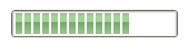
Most of the time it can, but it could fit in a bit better. So I took a little bit of time to dig into the ProgressBar element that WPF provides. By default, the progress bar can be used with the following line of code and you get the result to the right:
<ProgressBarValue="75"Height="25"Width="150"/>
Pretty standard, huh? Well, I wanted to jazz it up a bit and allow the progress of our signal being charged to fit into our application a bit better. So, the first step in doing so is to take a look at the ProgressBar's default visual tree (copy of its control template). Below is what Blend tells us about it:
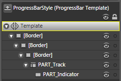
Looks like we are dealing with 3 Borders and 2 other elements names PART_Track and PART_Indicator. Well the real magic lies in those 2 oddly named elements! These names allow for us to gain some great logic that Microsoft already implemented. For this example, when you have these 2 elements with those names the PART_Indicator will ensure that the width (or height if orientation = vertical ) remains the correct percentage of the width(or height) of the PART_Track taking care of the math to fill in the progress bar, based on the progress bar's Value, Minimum and Maximum properties. This is a huge benefit for us to take advantage of, especially since we can manipulate the look to be whatever we can dream of and have the control itself do all the math!
Digging into the PART_Track element, we see that it is of type DockPanel and it contains only 1 child, PART_Indicator which is of type Rectangle. The PART_Track element is a container for the area to be filled up by the PART_Indicator. The PART_Indicator are the little green rectangles that are filling up the progress bar.
Let us first manipulate PART_Track into looking a little different then the standard rectangle shape. First, change the type of PART_Track to something other than a DockPanel; I have changed it to a Path. I chose a Path since I can add an attached property called Data that will allow me to change the way PART_Track looks. I used Design to draw a new design with the pen and then export it as a Path:
<Path x:Name="PART_Track" HorizontalAlignment="Left" Stretch="Fill" StrokeLineJoin="Round" Stroke="Black" StrokeThickness="2" Data="F1 M 72.5,114.333L 123.833,114.333L 123.833,99.8889L 126.278,114.667L 131.944,102.778L 128.833,114.667L 135.611,108L 131.611,115.222L 135.611,120.222L 131.167,117.333L 130.833,125.778L 128.5,117.556L 124.167,129.556L 123.722,117.667L 72.5,117.667L 72.5,114.333 Z ">
As you can see, the largest attached property is Data which contains the actual points to correctly draw the path. Below is what the path should look like:
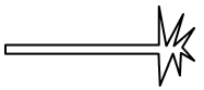
I know, I'm no graphic artist but at least it's something different than a rectangle! So this is, hopefully, our outline for our progress bar. Now Path does not contain an Content property or something to hold a child since it is not a container. So lets just put our PART_Indicator below this element for now. Remember to put both of these elements in some sort of container and I would suggest a grid since we want the PART_Indicator to fill the PART_Track and they can lie on top of each other. So far we have the following code:
<ControlTemplate x:Key="progressBarBang" TargetType="{x:Type ProgressBar}">
<Grid>
<Path x:Name="PART_Track" HorizontalAlignment="Left" Stretch="Fill" StrokeLineJoin="Round" Stroke="Black" StrokeThickness="2" Data="F1 M 72.5,114.333L 123.833,114.333L 123.833,99.8889L 126.278,114.667L 131.944,102.778L 128.833,114.667L 135.611,108L 131.611,115.222L 135.611,120.222L 131.167,117.333L 130.833,125.778L 128.5,117.556L 124.167,129.556L 123.722,117.667L 72.5,117.667L 72.5,114.333 Z "/>
<Rectangle HorizontalAlignment="Left" Margin="1" x:Name="PART_Indicator" />
</Grid>
</ControlTemplate>
And when we run this we get ... uh oh, same thing as above! What went wrong ... well, just having the magic name PART_Indicator in some element within the control template is not quite enough to display it correctly. For our scenario here, we would like the PART_Track to be filled by the PART_Indicator. I won't go through some of the magic that is below, but basically the fill property on the path is using a converter that Microsoft already provides in the PresentationFramework.Luna.dll named ProgressBarBrushConverter. Microsoft uses the converter to actually create each green rectangle that the PART_Indicator needs to show. The converter is used as the fill property is binding to 5 property's; 2 from its parent (the progress bar), 2 from the PART_Indicator and the other from PART_Track. (I will provide the actual code that I got using reflector in my sample).
<ControlTemplate x:Key="progressBarBangFill" TargetType="{x:Type ProgressBar}">
<Grid>
<Path x:Name="PART_Track" HorizontalAlignment="Left" Stretch="Fill" StrokeLineJoin="Round" Stroke="Black" StrokeThickness="2" Data="F1 M 72.5,114.333L 123.833,114.333L 123.833,99.8889L 126.278,114.667L 131.944,102.778L 128.833,114.667L 135.611,108L 131.611,115.222L 135.611,120.222L 131.167,117.333L 130.833,125.778L 128.5,117.556L 124.167,129.556L 123.722,117.667L 72.5,117.667L 72.5,114.333 Z ">
<Path.Fill>
<MultiBinding>
<MultiBinding.Converter>
<converters:ProgressBarBrushConverter />
</MultiBinding.Converter>
<Binding Path="Foreground" RelativeSource="{RelativeSource TemplatedParent}"/>
<Binding Path="IsIndeterminate" RelativeSource="{RelativeSource TemplatedParent}"/>
<Binding Path="ActualWidth" ElementName="PART_Indicator"/>
<Binding Path="ActualHeight" ElementName="PART_Indicator"/>
<Binding Path="ActualWidth" ElementName="PART_Track"/>
</MultiBinding>
</Path.Fill>
</Path>
<Decorator HorizontalAlignment="Left" Margin="1" x:Name="PART_Indicator" />
</Grid>
</ControlTemplate>
and it looks a little something like this:
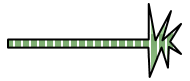
As you can see, when the progress bar gets filled up it automatically stretches and fills up the occupying space that the path gives it. Thanks Microsoft for doing that math for me!
Here's the complete code to the above example with a slider that allows you to control the progress of the progress bar:
<Page
xmlns=http://schemas.microsoft.com/winfx/2006/xaml/presentation
xmlns:x=http://schemas.microsoft.com/winfx/2006/xaml
xmlns:Microsoft_Windows_Themes_Luna="clr-namespace:Microsoft.Windows.Themes;assembly=PresentationFramework.Luna"
>
<Page.Resources>
<ControlTemplate x:Key="progressBarBang" TargetType="{x:Type ProgressBar}">
<Grid>
<Path x:Name="PART_Track" HorizontalAlignment="Left" Stretch="Fill" StrokeLineJoin="Round" Stroke="Black" StrokeThickness="2" Data="F1 M 72.5,114.333L 123.833,114.333L 123.833,99.8889L 126.278,114.667L 131.944,102.778L 128.833,114.667L 135.611,108L 131.611,115.222L 135.611,120.222L 131.167,117.333L 130.833,125.778L 128.5,117.556L 124.167,129.556L 123.722,117.667L 72.5,117.667L 72.5,114.333 Z ">
<Path.Fill>
<MultiBinding>
<MultiBinding.Converter>
<Microsoft_Windows_Themes_Luna:ProgressBarBrushConverter />
</MultiBinding.Converter>
<Binding Path="Foreground" RelativeSource="{RelativeSource TemplatedParent}"/>
<Binding Path="IsIndeterminate" RelativeSource="{RelativeSource TemplatedParent}"/>
<Binding Path="ActualWidth" ElementName="PART_Indicator"/>
<Binding Path="ActualHeight" ElementName="PART_Indicator"/>
<Binding Path="ActualWidth" ElementName="PART_Track"/>
</MultiBinding>
</Path.Fill>
</Path>
<Rectangle x:Name="PART_Indicator" HorizontalAlignment="Left" Margin="1" />
</Grid>
</ControlTemplate>
</Page.Resources>
<StackPanel>
<ProgressBar Template="{StaticResource progressBarBang}" Value="{Binding ElementName=sliderCharge, Path=Value, Mode=OneWay}" Height="75" Width="150" />
<Slider x:Name="sliderCharge" Minimum="0" Maximum="100" LargeChange="25" TickFrequency="10" TickPlacement="BottomRight" Value="50" Width="200" Margin="0,15,0,0" HorizontalAlignment="Center"/>
</StackPanel>
</Page>
Just copy and paste into something like XAMLPad or Kaxaml to see it in action!
Now if you wanted to change the Path data to something a bit more interesting you could do that. I used Design again and exported some text as 1 whole path and changed the foreground to red and added 1 trigger for when the value reaches the maximum to change the outline to a different color and change the actual path data. I got the following:
 ---->
----> 
I have posted the full source code to this and some more examples that I threw together. The .xaml file contains all of the examples that the VS example has except for the vista style progress bar. This is due to the xmlns definition not being found for some reason that contains the correct converter for the vista progress bar. You have to actually include that dll as a reference in your project for it to work. If someone can get it to work through straight xaml I would gladly like to see. The straight .xaml file can be run in internet explorer. Enjoy, and please leave any and all feedback.